Crew
Brand identity & Logo design: Off+brand
Art Director: Emilia Carlsson
Client: Kaffekassan
the problem
Kaffekassan helps young people sell coffee to raise money for their class or team. The product was established. The brand was not. A logo with no distinct character, disconnected from the rest of the identity, difficult to use consistently anywhere it needed to show up.
The real problem was structural. The ones doing the selling are kids. The ones saying yes are adults. Both have to buy in. That is not a compromise. That is a design problem.
OLD LOGO
NEW LOGO
Logo update
Small refinements to the logo helped express Kaffekassan's warmth and approachability, reinforcing a sense of community while improving clarity and recognition.
VISUAL IDENTITY
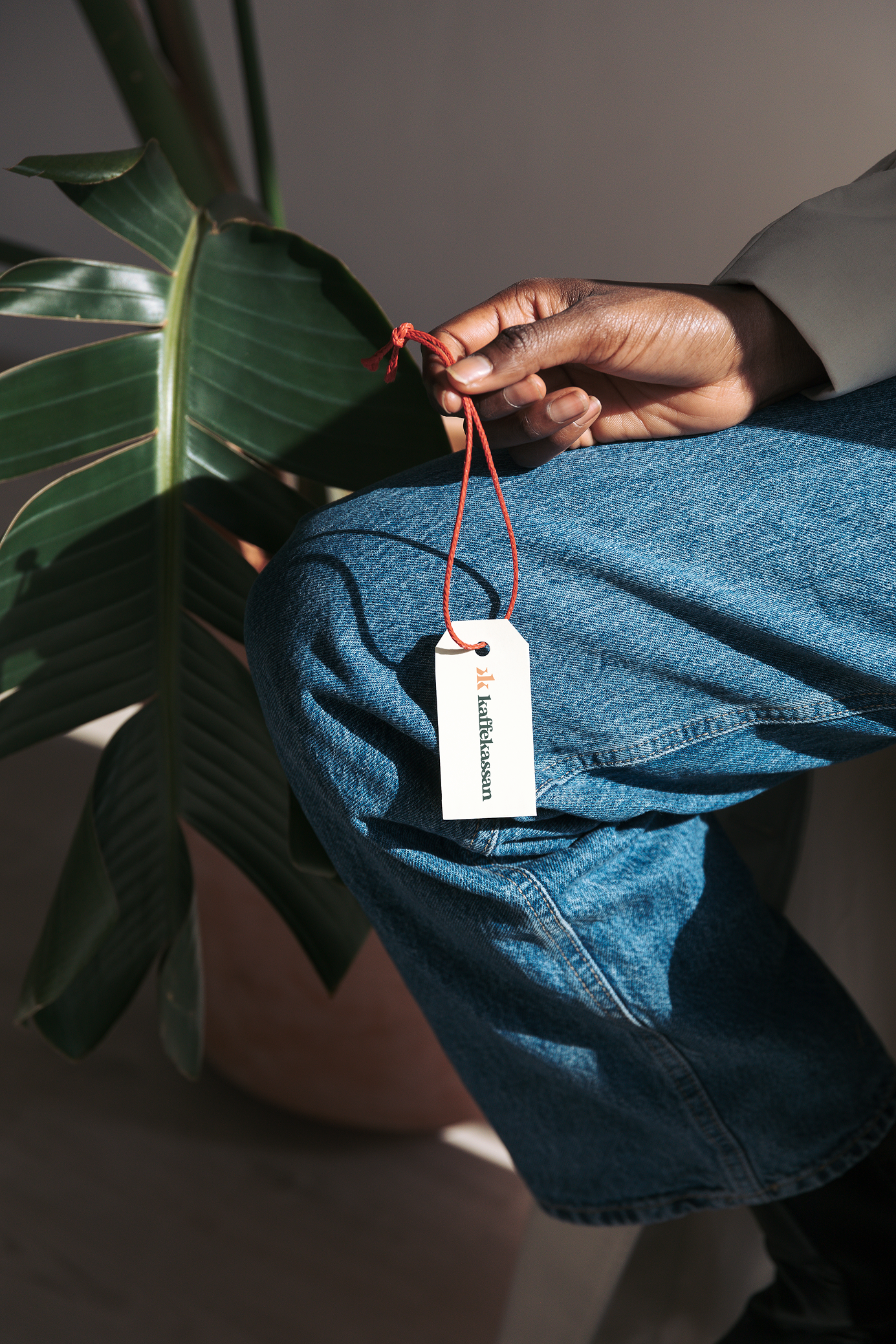
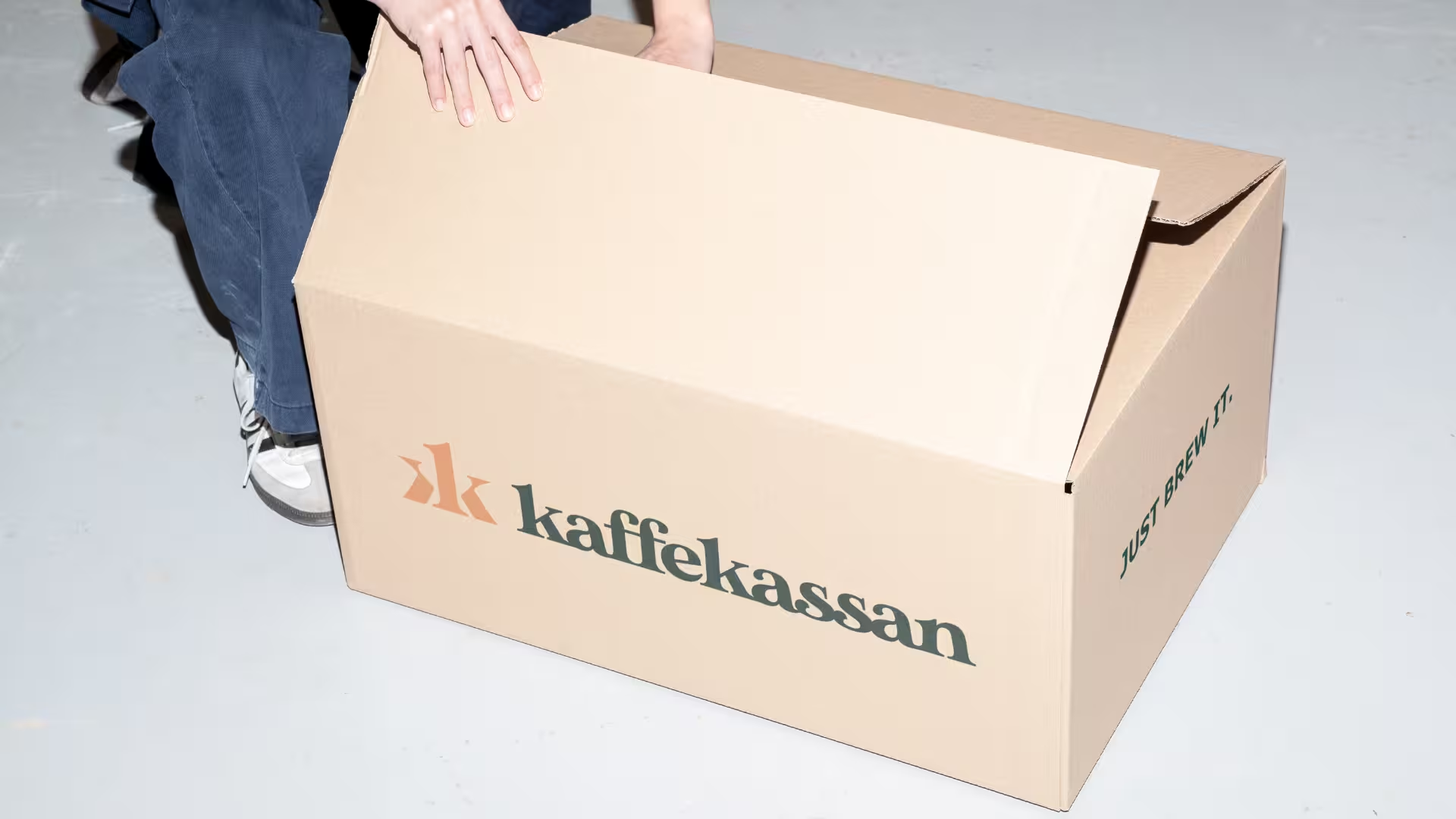
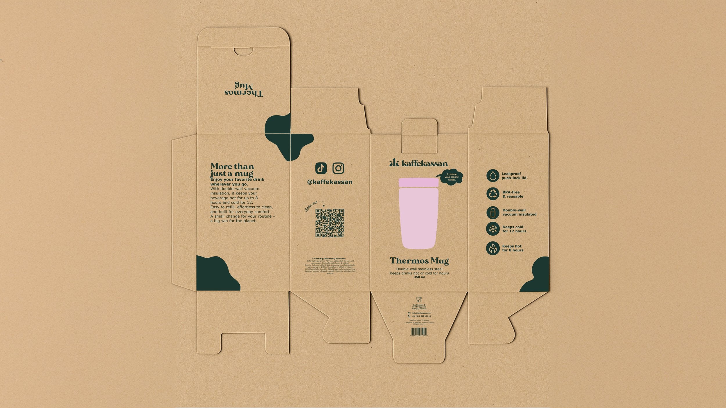
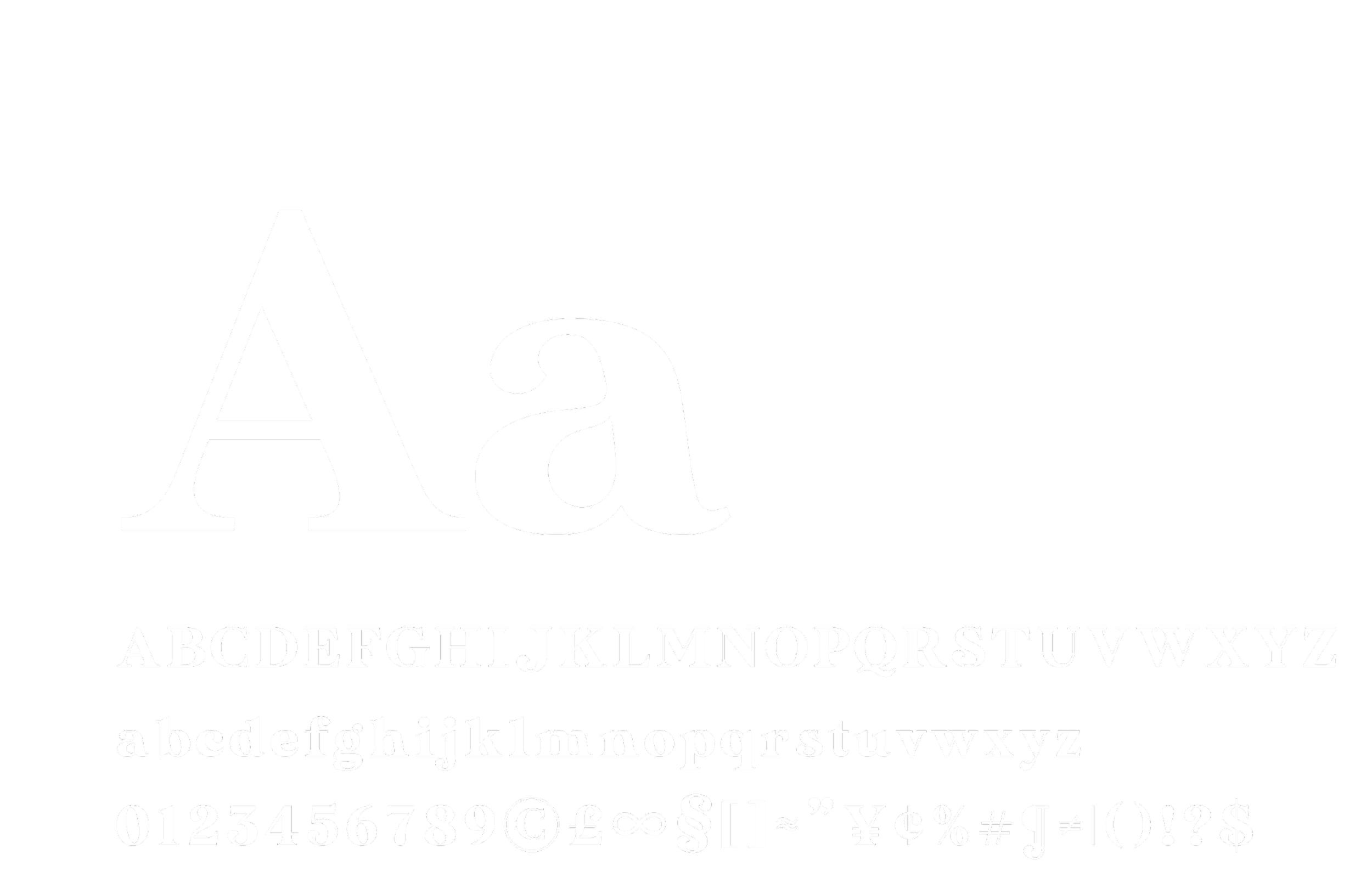
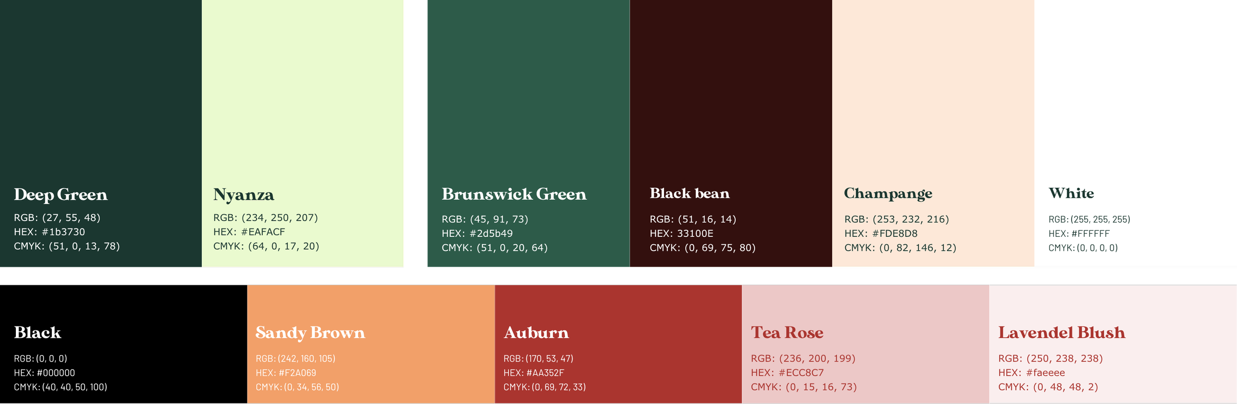
The identity is built from the organic world of coffee itself. Earthy tones, kraft textures, and a confident serif typeface that signals craft without overplaying it. Fluid abstract patterns run through the system as a playful counterpoint, keeping the brand from taking itself too seriously. The result is a visual language that feels both trustworthy and alive.


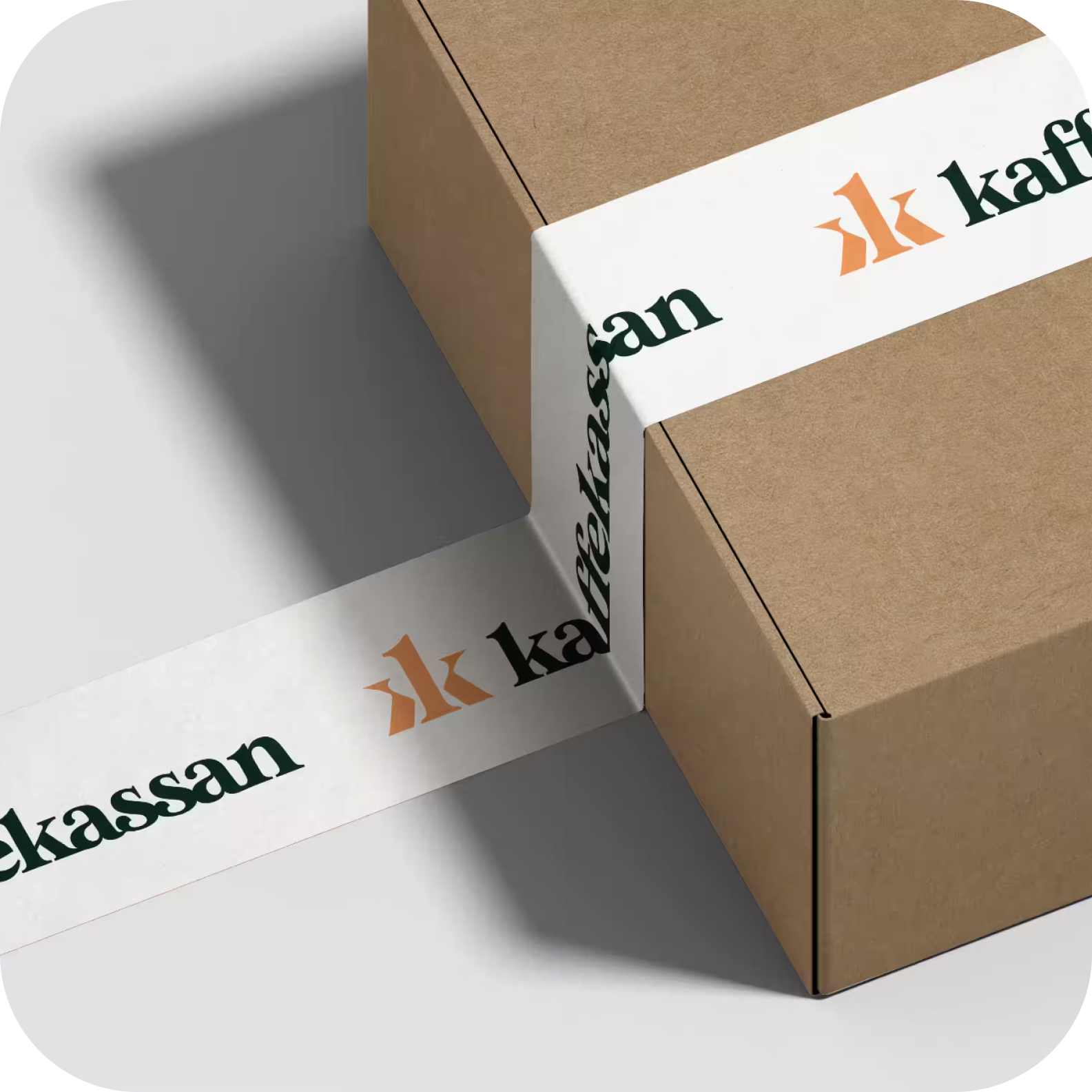
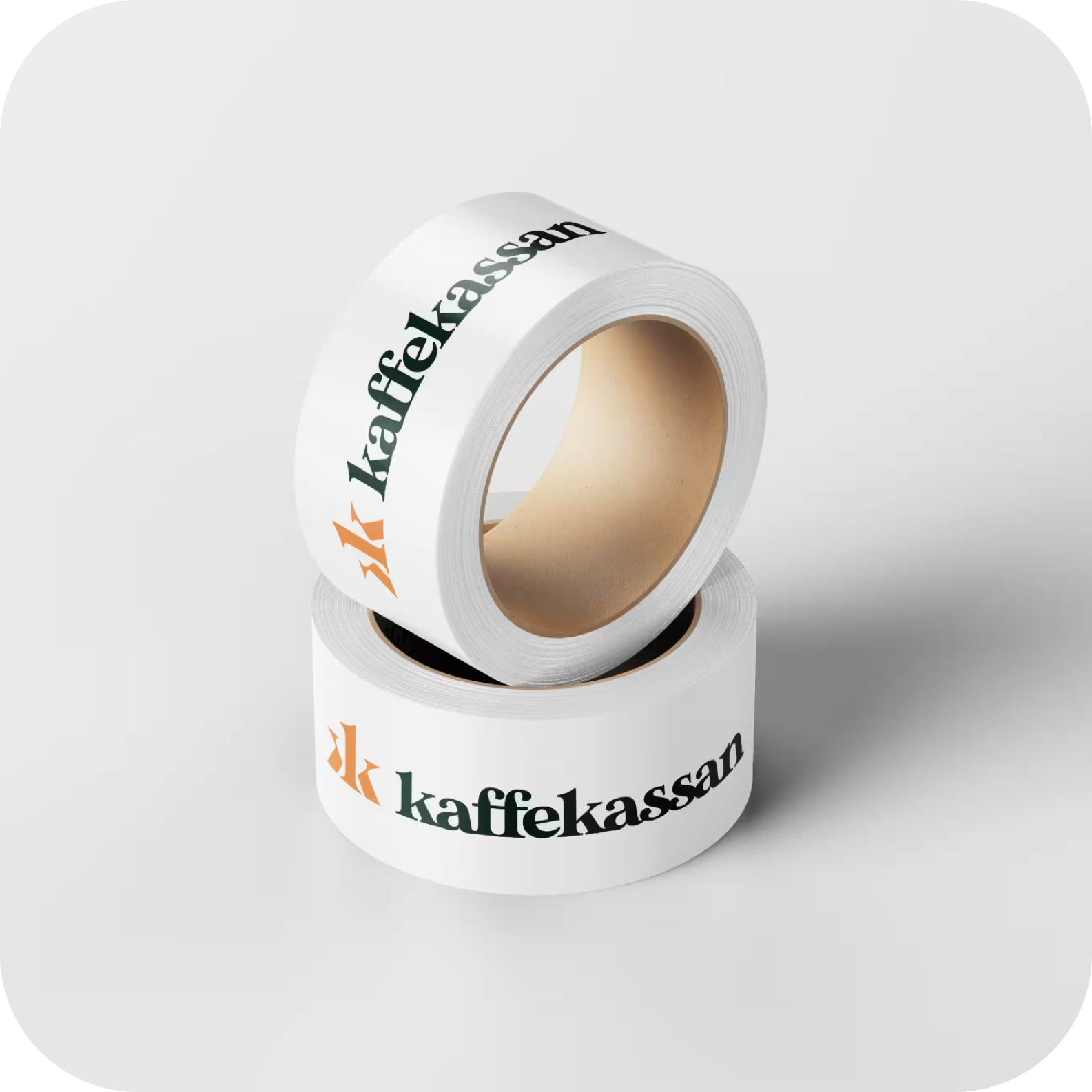
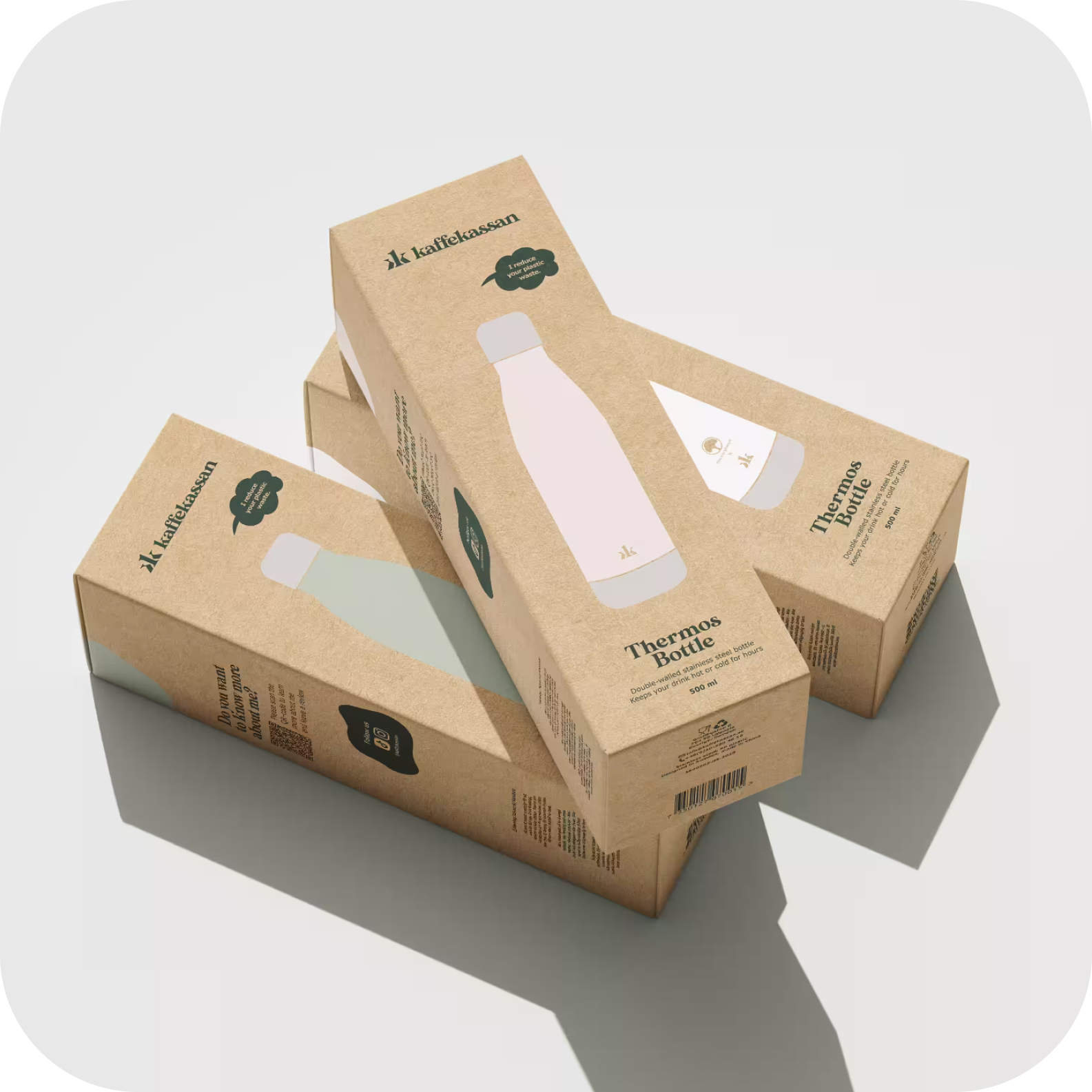
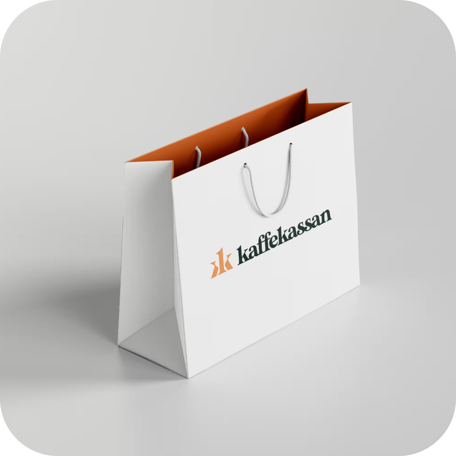
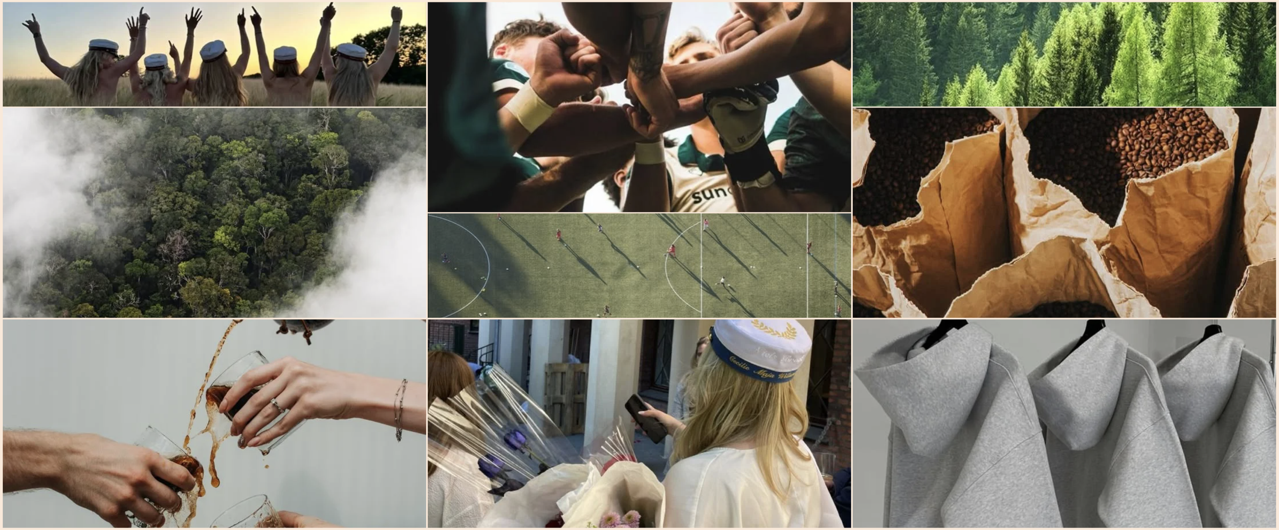
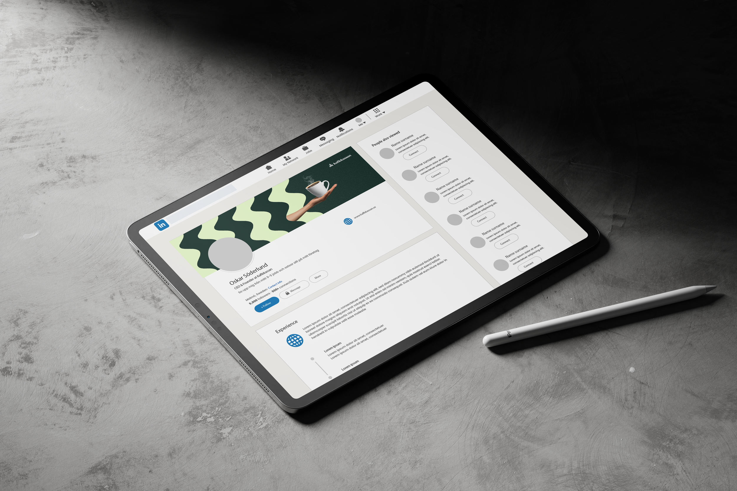
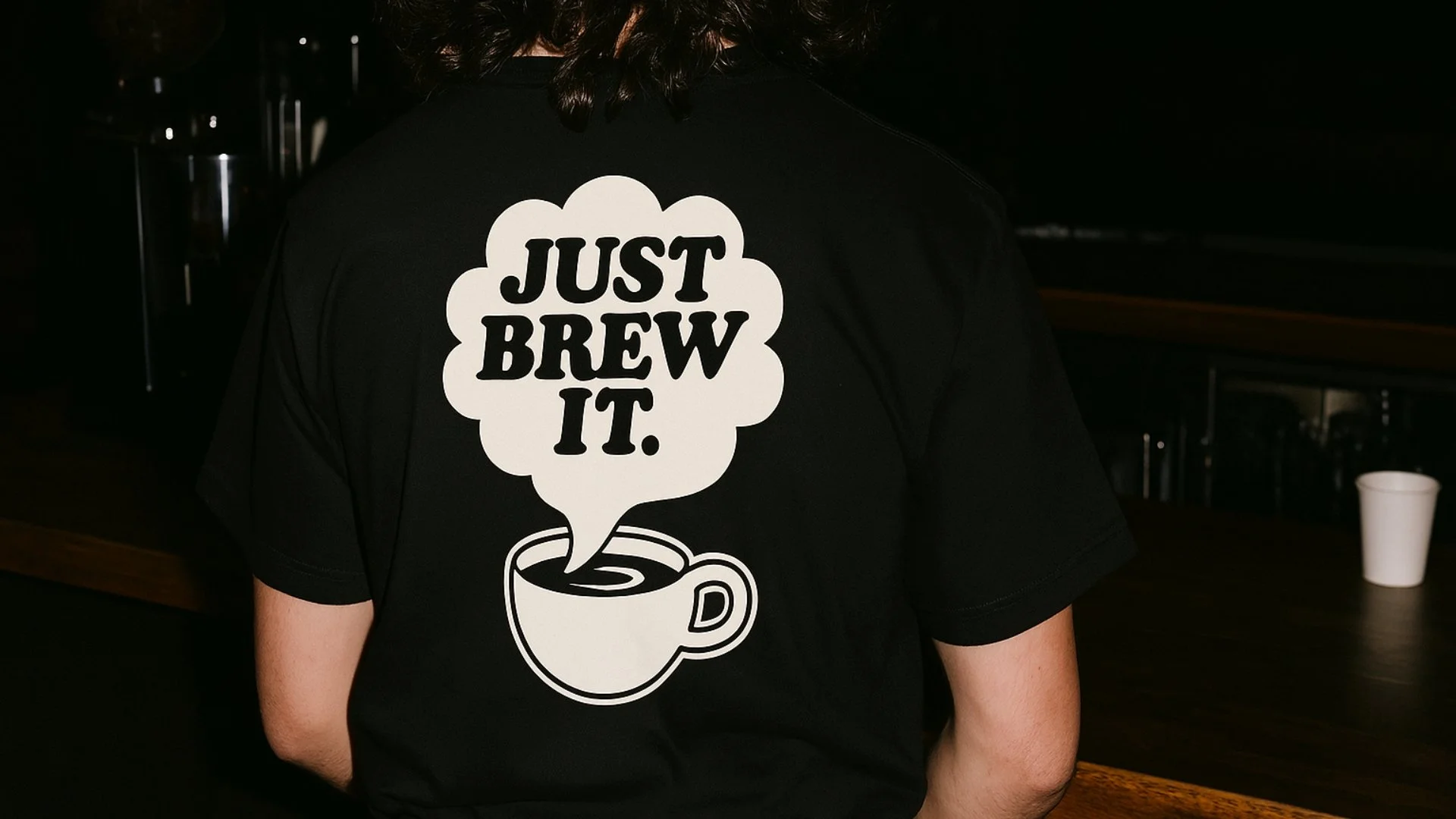
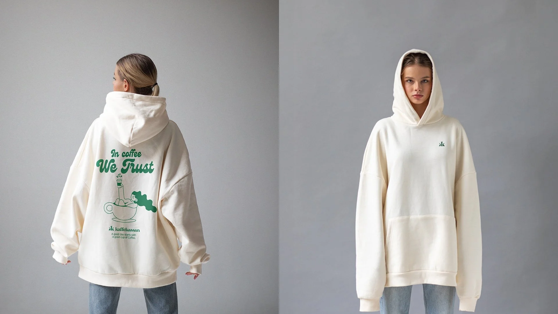
The identity was applied across packaging, campaigns, merchandise, and digital experiences. Each element was designed to strengthen recognition while keeping the focus on participation, progress, and collective achievement.
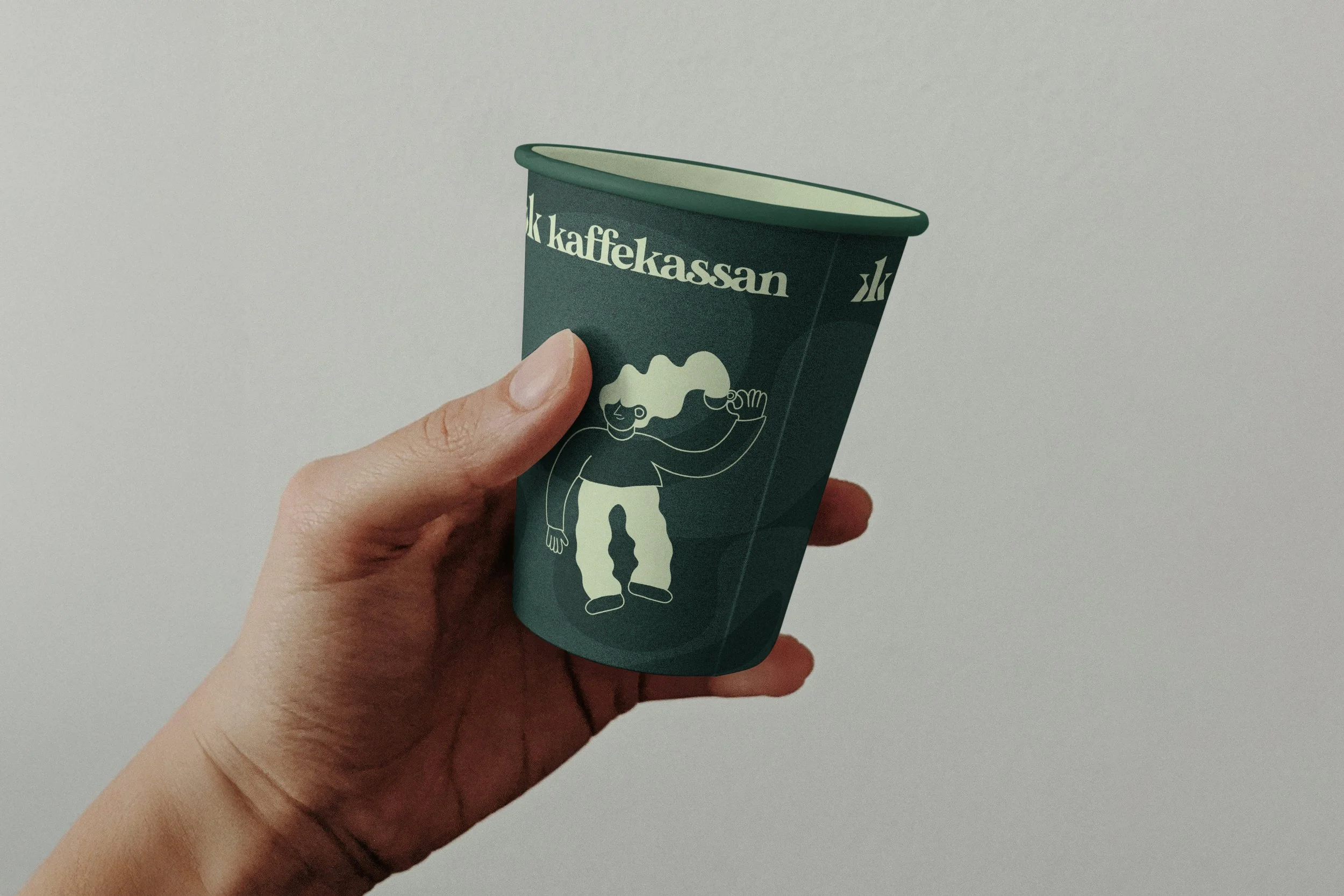
Mascot & Iconography
A mascot and icon system built to give the brand a face and a vocabulary. Meet Brewster: born from steam and aroma, his head a coffee cup, his hair shaped by heat, his legs the swirling energy of a perfect brew. He is Kaffekassan personified. Playful enough to make kids smile, distinctive enough to be remembered. The supporting icon set extends his world, cups, hands, ideas, and the small shared moments that make selling coffee feel like something worth doing together.

THE RESULT
Logo revision, color system, typography, tone of voice, strategic foundation. One coherent identity built to hold together across packaging, digital, and campaign.
Warm enough that kids want to be part of it. Credible enough that parents don't think twice.
The result is a brand that looks like it means business. And that kids actually want to wear on a t-shirt.