Crew
Logo & Brand identity: Off+brand
Client: Hook Digital
We gave Hook Digital, one of Sweden's sharpest email marketing agencies, a brand identity built for the next level.
Hook Digital didn't need a brand to survive. Clients were already coming in. Johannes Höök had built something real without a visual identity to match. But surviving and scaling are different problems. If Hook Digital was going to grow the way Johannes had planned, it needed a foundation that could carry the weight of that ambition. A brand that signals where you're going, not just where you've been.

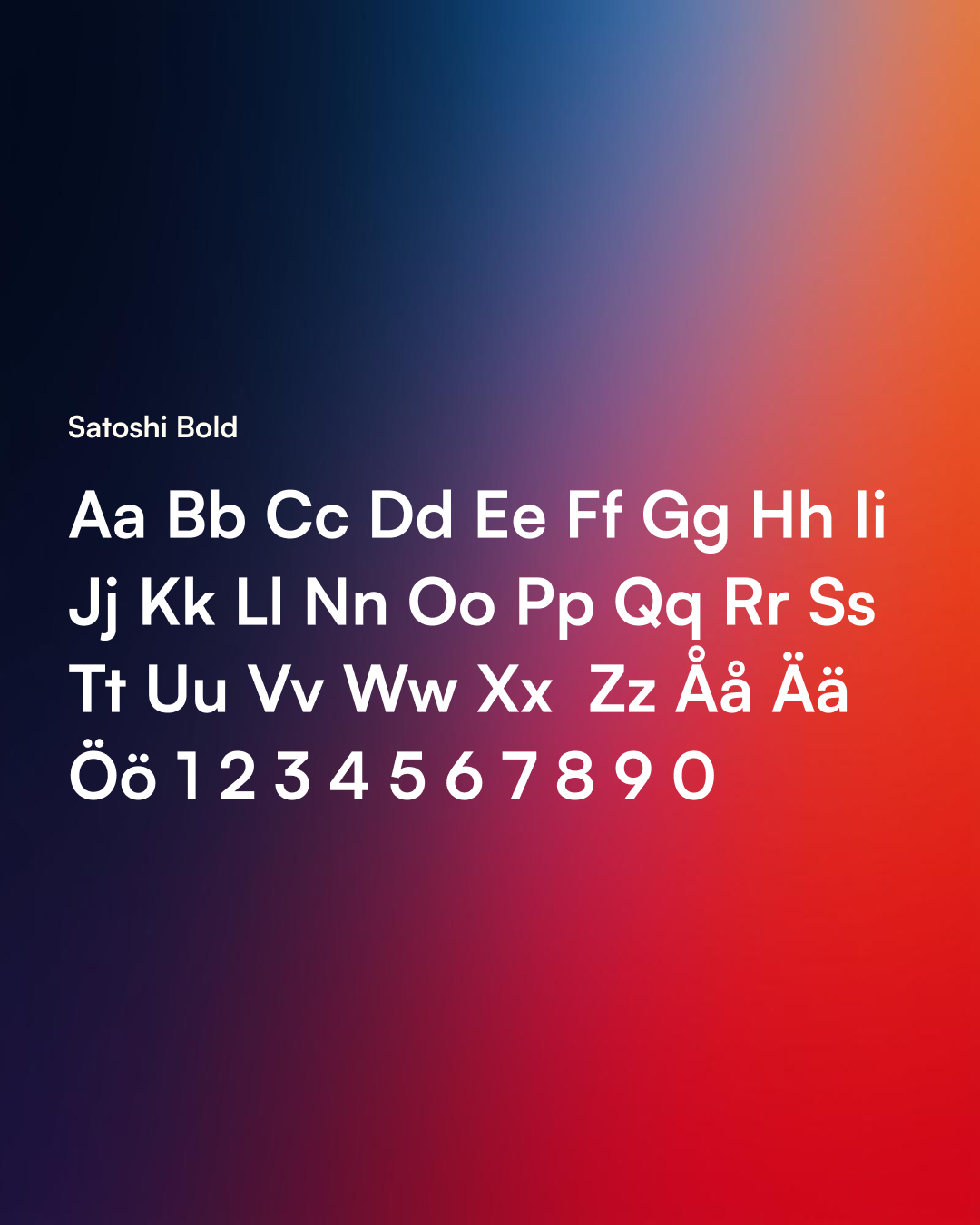
LOGO Design
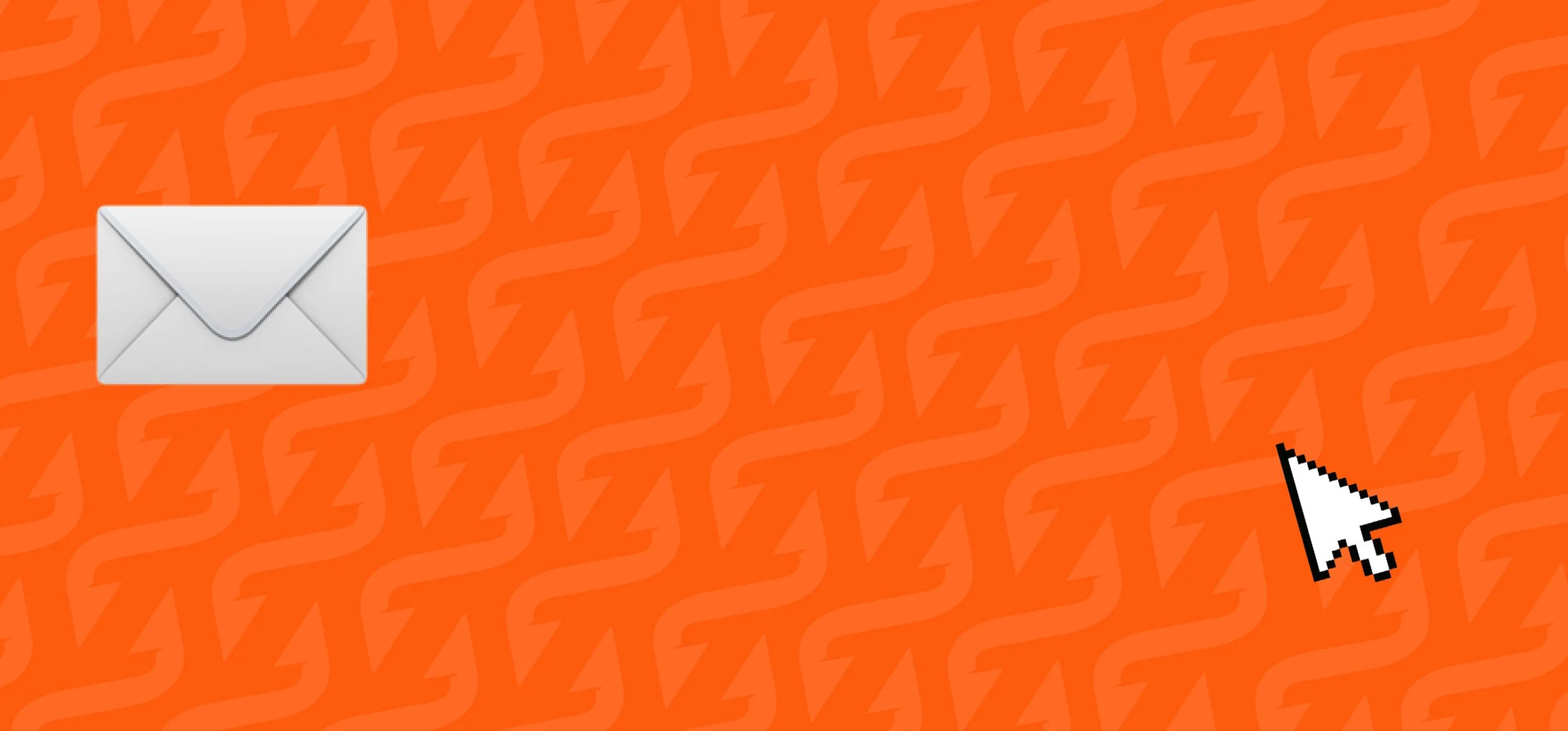
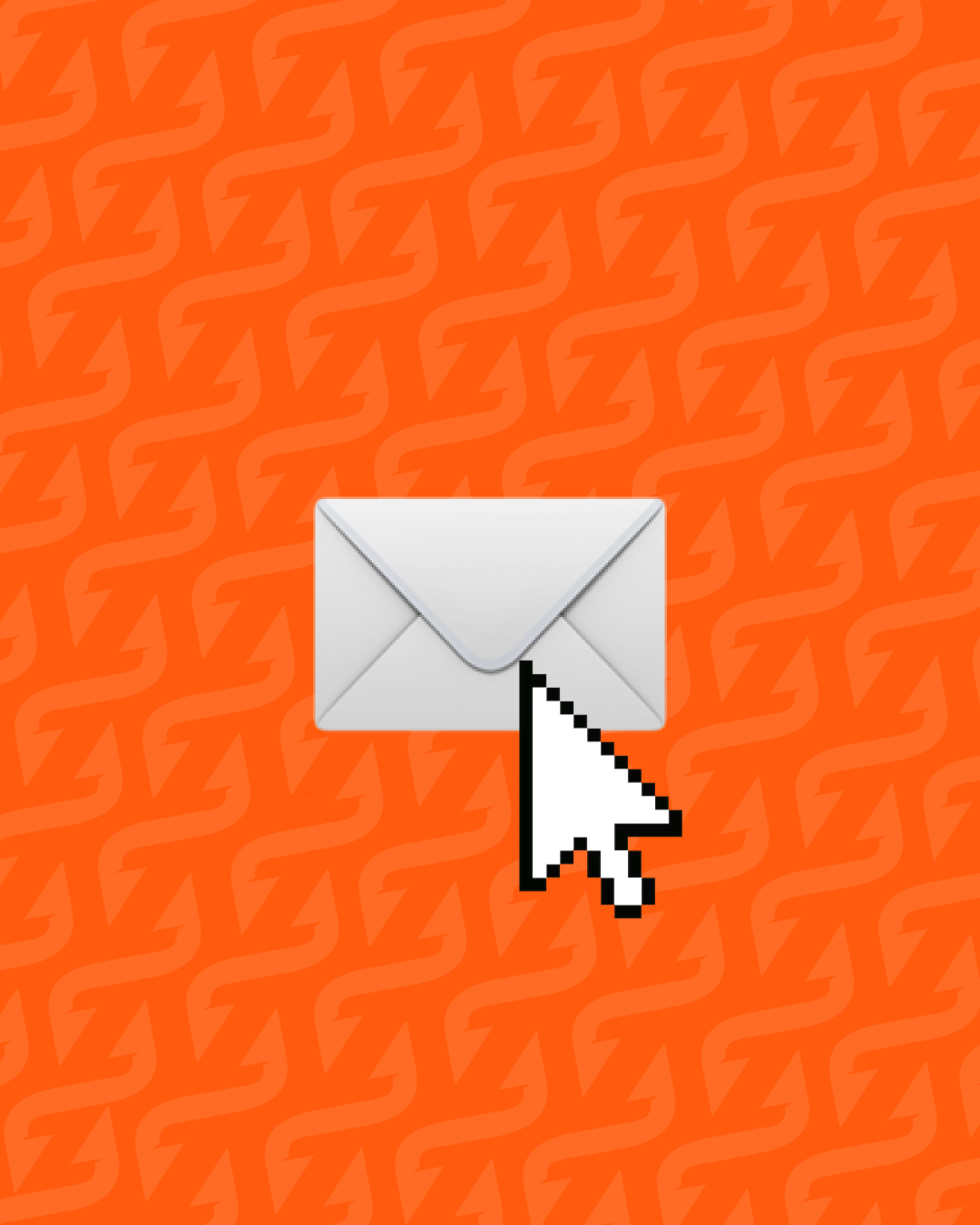
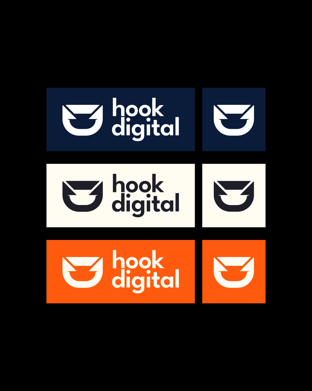
The logo merges a fishing hook with an envelope, two ideas collapsed into one symbol that says exactly what the agency does without explaining itself. Confident, precise, and simple enough to scale anywhere.
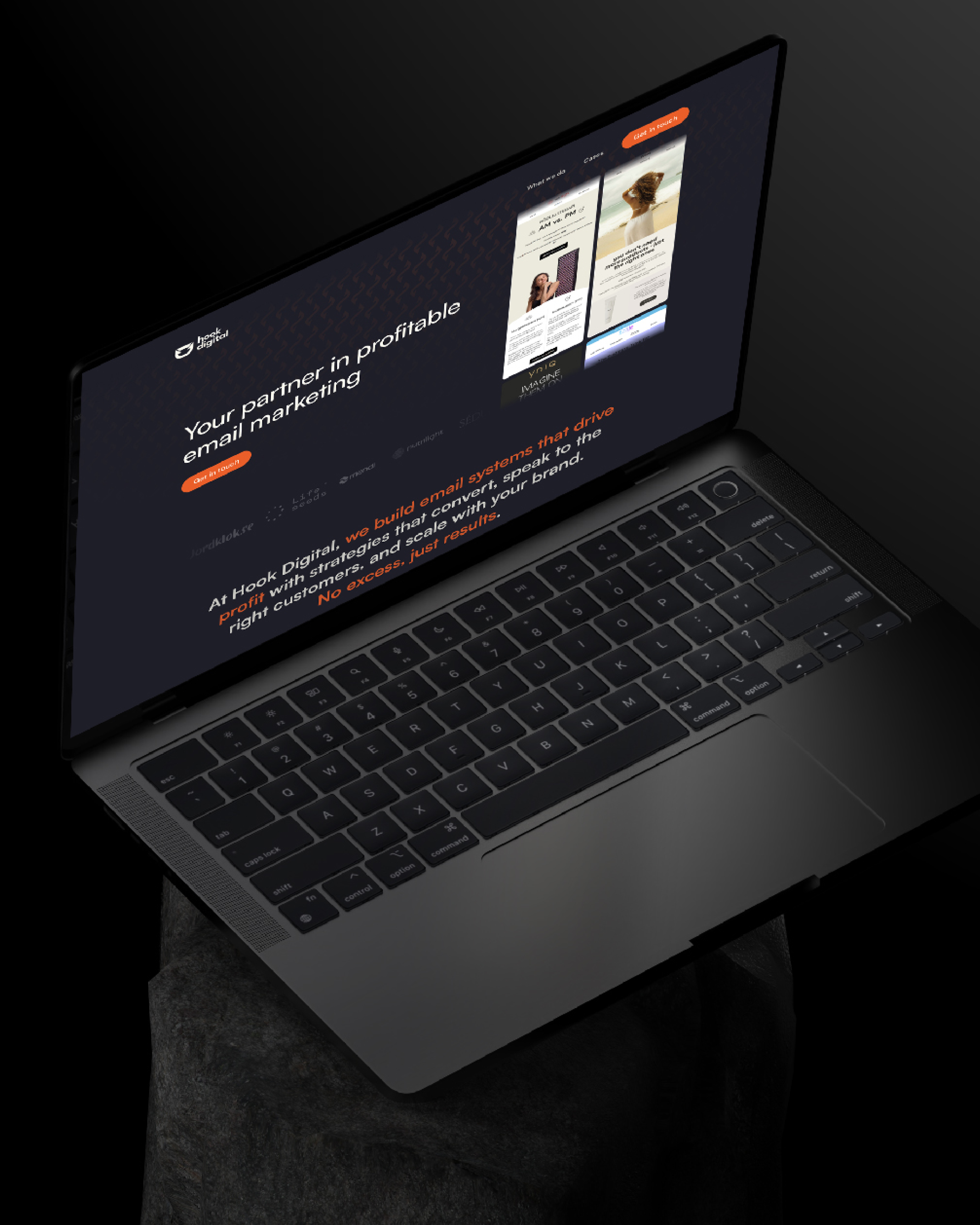
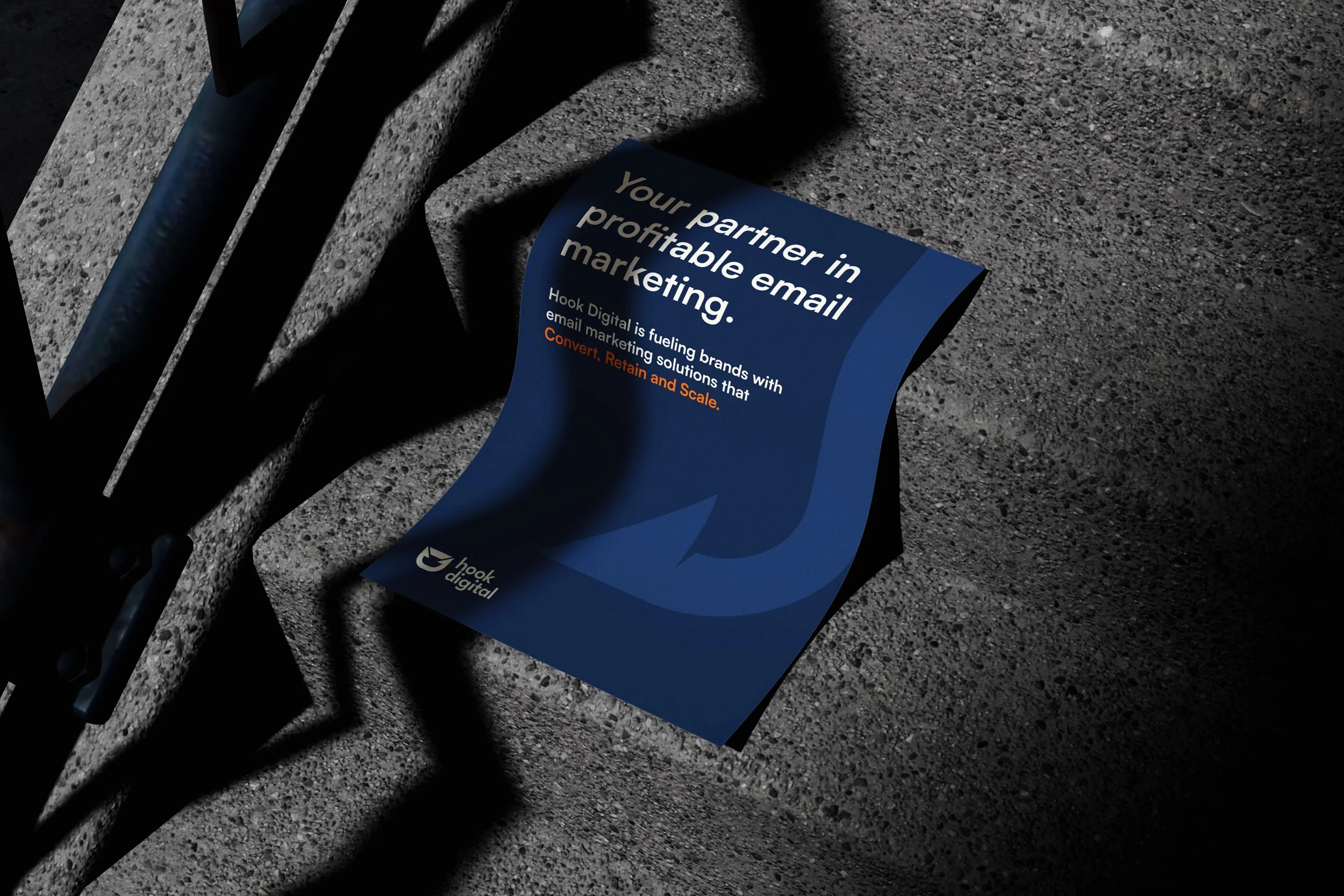
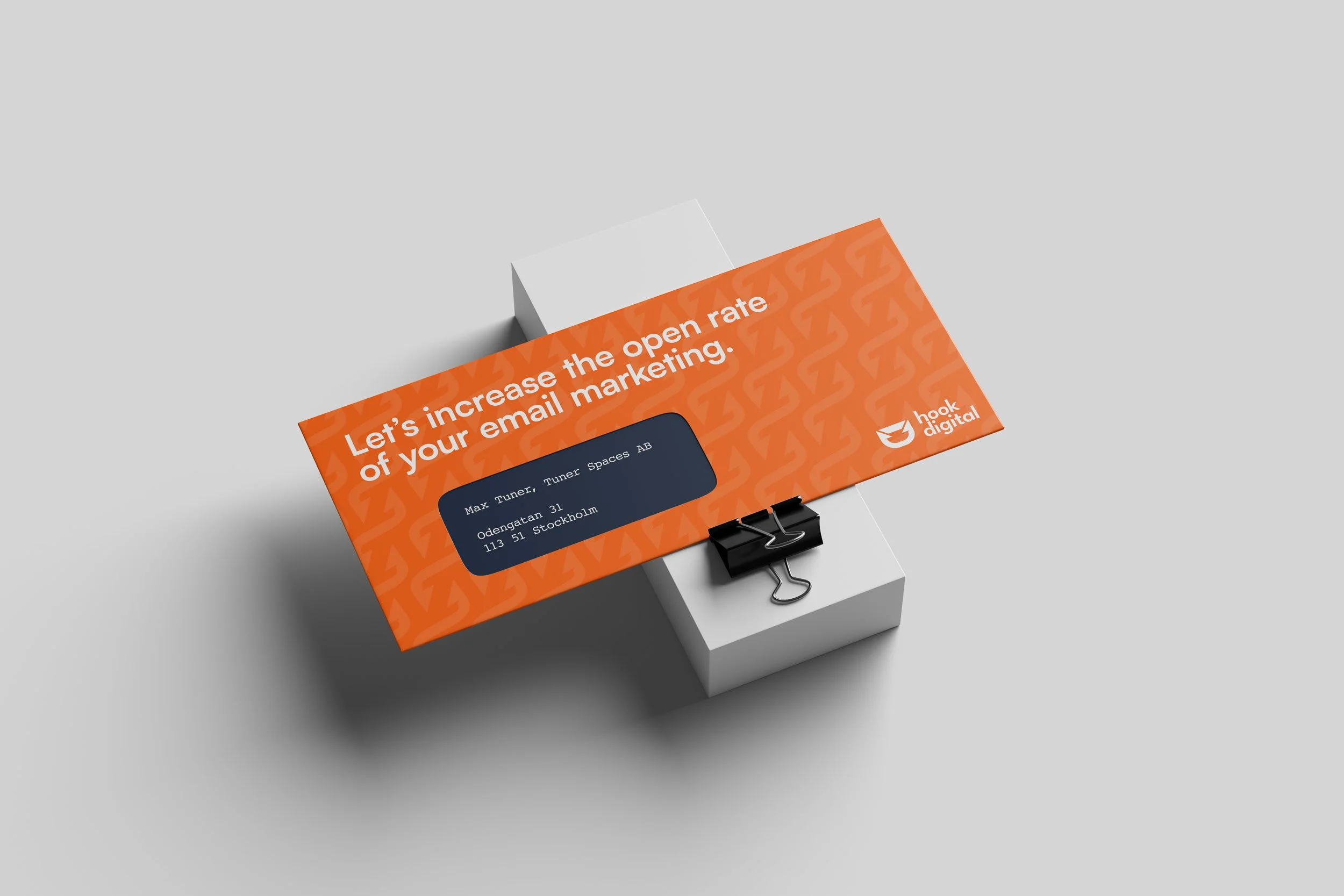
THE RESULT
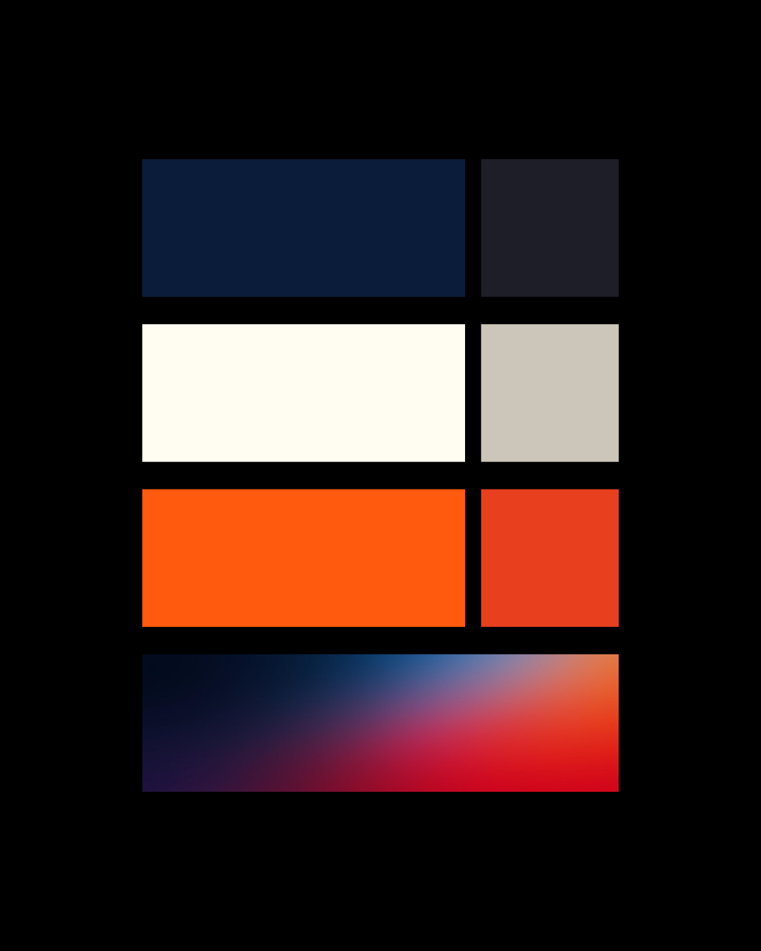
A brand new logo, color system, typography, social media templates, brand guidelines. An identity that combines technical precision with a human edge. Confident without being cold. Clear without being corporate. The kind of brand that makes it easier to hire the right people, attract the right clients, and grow in the right direction.
Partnership
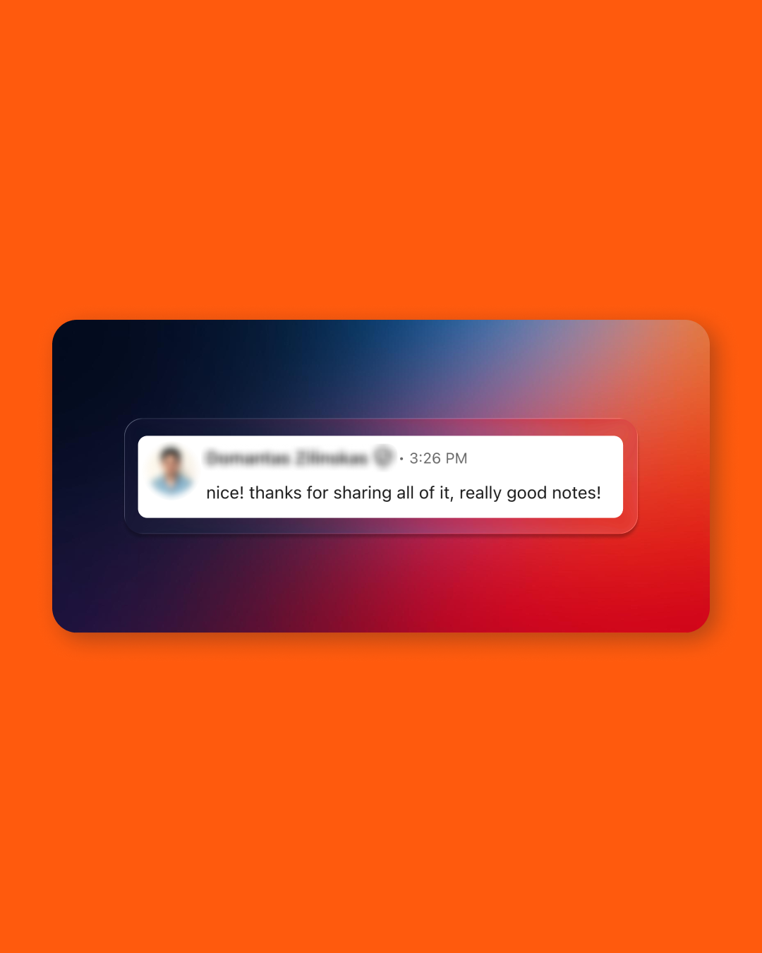
There is something particular about being trusted with another agency's brand. The people who commission this work know exactly what goes into it. No shortcuts get past them. Doing it right matters more, not less.
After the project wrapped, Off+brand and Hook Digital formalized what had already become obvious. Our two studios now work closely together, combining Creative Direction with email marketing execution for clients who need both.
